ABP1 / YCR088W
Clustering: [gene]
genome
Data: [DNA] protein
Error loading sequence data
No sequence data
Data: [DNA] protein
Error loading sequence data
No sequence data
Loading SNP viewer
Clustering:
[gene]
genome
Data: DNA [protein]
Error loading sequence data
No sequence data
Data: DNA [protein]
Error loading sequence data
No sequence data
Loading SNP viewer
Clustering:
gene
[genome]
Data: [DNA] protein
Error loading sequence data
No sequence data
Data: [DNA] protein
Error loading sequence data
No sequence data
Loading SNP viewer


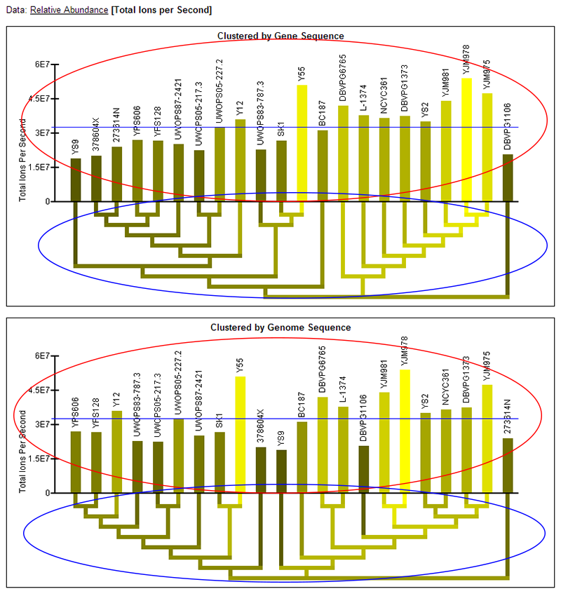
Data: [Relative Abundance]
Total Ions per Second

Clustered by Gene Sequence
Clustered by Genome Sequence
Data:
Relative Abundance
[Total Ions per Second]

Clustered by Gene Sequence
Clustered by Genome Sequence

X
Help Page
[SNP Viewer]
RNA Data
Protein Data
Peptide Heatmap Data


SNP viewer help:
The SNP viewer allows users to quickly find and view sequence variation for specific genes or
proteins between the separate strains of S. cerevisiae.
Here is a screen capture of the SNP viewer:
At a high level, using the links at the top allow users to switch between having the strains clustered by the
current gene's sequence or genome sequence, and to switch between viewing DNA or protein sequence. The sequence bar below this
allows users to view where the areas of genetic variation are along the gene or protein sequence and navigate to
them by clicking on the bar. This bar also indicates density of variation (height) and significance of the variation
(intensity of red). Below this, the strains are hierarchically clustered to the left and each respective strain's sequence
is displayed to the right. The section of sequence displayed corresponds to the viewing window, or dashed box in the
sequence bar above. Columns are highlighted in the sequence window that indicate the significance of variation at this
position. Below this, red arrows allow navigation one page at a time across the sequence.
More detailed explanations follow:
Top Navigation:
- "[gene]" indicates that the strains are clustered hierarchically (the red dendrogram next to the strain names below) according to this gene's sequence. Clicking "genome" changes the clustering so that the strains are clustered according to the whole-genome sequence of the strains. Users may switch back and forth by clicking these two links.
- "[DNA]" indicates that the SNP viewer is currently displaying the DNA sequence for the gene. Clicking "protein" causes the protein sequence to be displayed. Users may switch back and forth by clicking these two links.
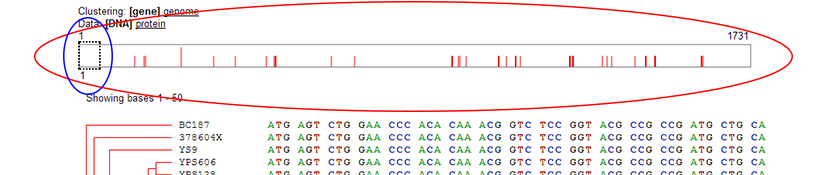
Sequence Bar:
- The sequence bar represents the entire sequence laid out horizontally. The dashed box (blue ellipse in screen shot) shows the current sequence viewing area, which notes the section of the sequence currently being displayed in the sequence window below. The dashed box may be clicked on and dragged to any location in the sequence bar. Additionally, the dashed box may be moved to any location in the sequence by directly clicking on that location in the sequence bar. Performing either operation will update the section of the sequence being displayed below to correspond to that section of the sequence. The number below the dashed box indicates the starting sequence position of the sequence viewing window.
- The red vertical lines in the sequence bar represent locations of sequence variation. Because sequences may be long, more than one
nucleotide or amino acid may be represented by a single line in the diagram. The height of the red line indicates how much variation is
represented by that single line in the graphic. The intensity of red represents a measure of how significant the variation is at this position
and is determined differently for DNA and protein sequences:
- DNA: Lines are either dark or light red. Light red indicates silent mutations, which do not result in changes in protein sequence.
- Protein: Lines vary from dark to light red on a continuous spectrum. The darker the red, the more significant, as calculated comparing all amino acids against each other in this position across all selected strains using the BLOSUM80 matrix.
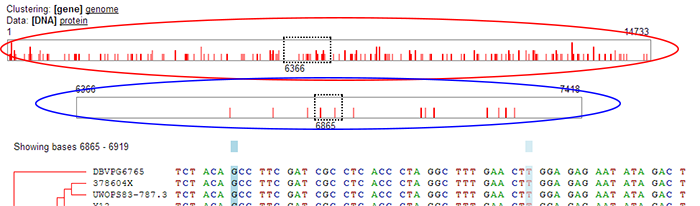
Special Case: Double Sequence Bar:
Because the dashed box in the sequence bar represents a fixed number of positions, it will appear narrower for longer sequences. In the case of extremely
long sequences, the dashed box would become too narrow to be useful as a user interface element. In these cases, a double sequence bar will appear automatically.
- Upper sequence bar: In the case of the double sequence bar the upper sequence bar (red ellipse) represents the entire gene or protein sequence. Moving the dashed box changes which section of the sequence is currently being viewed. But in the case of the double sequence bar, the dashed box in the upper sequence bar does not represent the window for which the sequence is being shown below (it represents too many positions to show at once). Instead, it shows which section of the overall gene or protein sequence is being represented by the lower sequence bar.
- Lower sequence bar: The lower sequence bar (blue ellipse) represents the section of the gene or protein sequence contained in the dashed box in the upper sequence bar. Essentially, it is a "zoomed in" view showing only the section of the sequence contained in the dashed box of the upper sequence bar. The dashed box in the lower sequence bar represents which part of the sequence is actually being displayed in the sequence window below. The dashed box may be dragged or moved via clicking.
Strain List:
- Dendrogram: The red dendrogram represents a hierarchical clustering of the strains according to either gene or whole genome sequence. (See "Top Navigation" above for how to switch between the two.) The names of the strains are listed to the right of the dendrogram.
- Strain names: One or more names may be clicked on to lock and highlight that strain in the SNP viewer. (See example image below.) If two or more strains are highlighted,
their names and sequences are highlighted in the sequence window. Additionally, only those strains' sequences are used when determining the areas of sequence variability. Only the highlighted
strains' sequences will, then, be used to determine the location and intensity of the red lines in the sequence bar above. Clicking on a locked strain will unlock it. Note: when no
strains are highlighted (the default), all strains are used when determining locations of sequence variability.

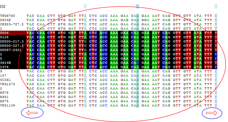
Sequence Window:
The sequence window (red ellipse) displays the gene or protein sequence for each strain for the given window, as defined by the dashed box in the sequence bar above. The
navigation arrows below the sequence (blue ellipse) provide another means for changing the current window. Assuming a window size of 50 nucleotides or amino acids, clicking
the left arrow moves to the previous 50 positions, and the right arrow moves to the next 50 positions. The blue shading denotes positions of sequence variability, with darker
blue indicating positions of more significant variation. This is determined using the general method described above in the "Sequence Bar" section.
Sequence Download:
Clicking this link initiates a download of a FASTA formatted file of this gene's or protein's sequences for all of the strains.
SNP Viewer
[RNA Data]
Protein Data
Peptide Heatmap Data

RNA Data help:
The "RNA Data" section shows the quantification results of our RNA-seq analysis, which describes the level of gene expression for a specific gene by measuring mRNA levels. Graphics are provided
for describing the relative gene expression across all strains as described by a statistical model applied to the data (described in the accompanying paper) and for absolute expression quantified as
Reads Per Kilobase per Million mapped reads (RPKM).
Switching between "relative abundance" and "RPKM":
The currently-selected data type will show up in bold and brackets as [Data Type]. In the above example, "Relative Abundance" is currently
selected. To switch to "RPKM" data, click the "RPKM" link. To switch back to "relative abundance, click the "Relative Abundance"
link.
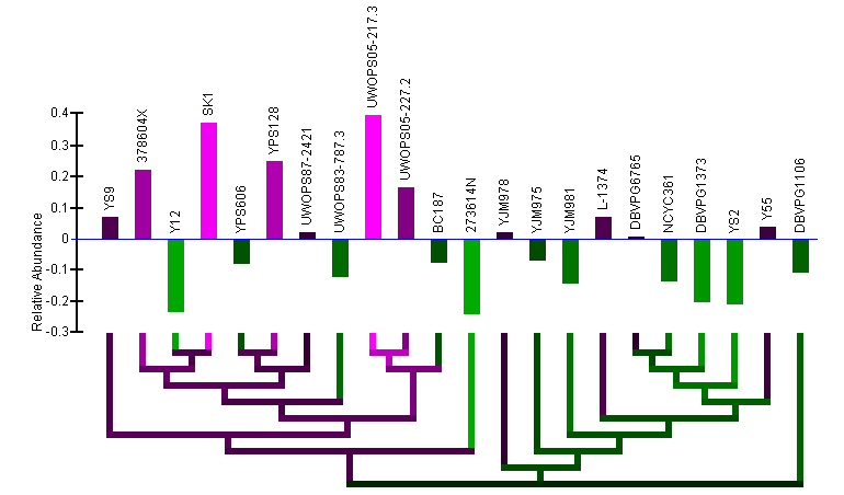
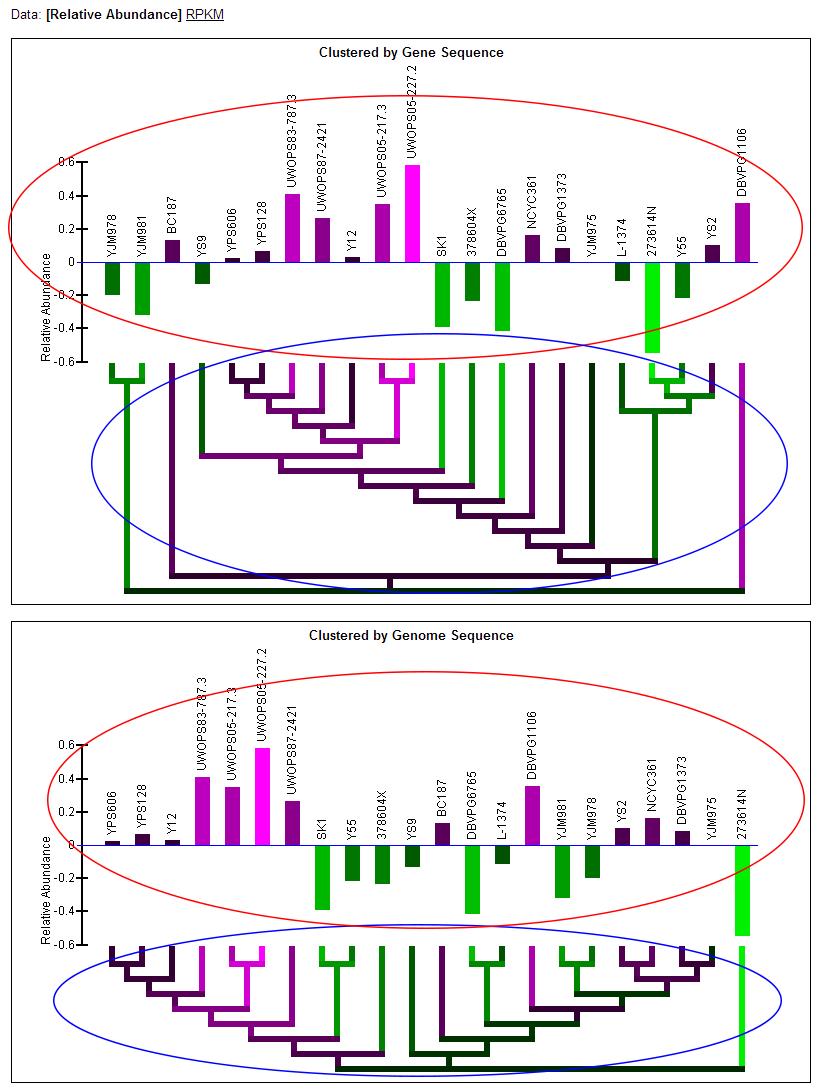
Relative Abundance data:
- Note: Two graphs are displayed simultaneously on the page. Both graphics are the same, except one has the strains clustered by the current gene's sequence and one has the strains clustered by genome sequence.
- Relative abundance bar graph: The bar graph portion of the graphic (red ellipse) indicates the relative abundance of mRNA as quantified by a statistical model applied to the data (described in paper) that examines deviation from the mean across the strains. Bars extending below the zero-line indicate a relative lower level of mRNA in those strains and will be colored green. Bars extending above the zero-line indicate a relatively higher level of mRNA and will be colored magenta. The more intense the colors, the higher or lower the level of mRNA. The name of each of the strains is written above the bars. The order of the strains in the bar graph is determined by a hierarchical clustering of the strains by either gene or genome sequence and the clustering is visualized by the dendrogram below the bar graph.
- Color-coded dendrogram: The dendrogram (blue ellipse) reflects the clustering of the strains by either gene or genome sequence. The color of any section of the dendrogram reflects an averaging of all the relative mRNA abundances of the strains contained by that section of the dendrogram. This is meant to provide visualization of the quantification data through the dendrogram and assist in finding patterns in expression that may exist in the context of the clustering.
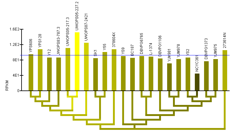
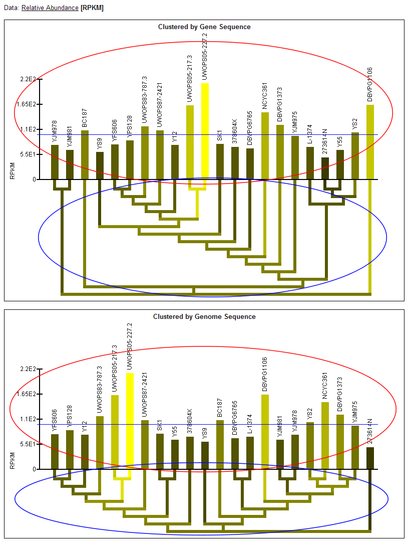
RPKM data:
- Note: Two graphs are displayed simultaneously on the page. Both graphics are the same, except one has the strains clustered by the current gene's sequence and one has the strains clustered by genome sequence.
- RPKM bar graph: The bar graph portion of the graphic (red ellipse) reflects mRNA levels for all strains as quantified by RPKM. The taller bars (brighter yellow) reflect a higher level of mRNA. The name of each of the strains is written above the bars. The order of the strains in the bar graph is determined by a hierarchical clustering of the strains by either gene or genome sequence and the clustering is visualized by the dendrogram below the bar graph.
- Color-coded dendrogram: The dendrogram (blue ellipse) reflects the clustering of the strains by either gene or genome sequence. The color of any section of the dendrogram reflects an averaging of all the RPKM measured for the strains contained by that section of the dendrogram. This is meant to provide visualization of the quantification data through the dendrogram and assist in finding patterns in expression that may exist in the context of the clustering.
SNP Viewer
RNA Data
[Protein Data]
Peptide Heatmap Data
Protein Data help:
The "Protein Data" section shows the quantification results of our proteomics analysis across all the strains. Quantification was determined based on total ions per second for all peptides for the protein,
where each peptide must match unambiguously to a single location of the protein and the same peptide must have been measured for all strains. See the accompanying paper for more information about the methods
used for protein and peptide quantification. Graphics are provided for describing the relative protein abundance across all strains as described by a statistical model applied to the data (described in the accompanying paper) and for absolute abundance as quantified by
total ions per second.
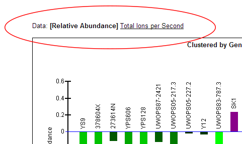
Switching between "relative abundance" and "total ions per second":
The currently-selected data type will show up in bold and brackets as [Data Type]. In the above example, "Relative Abundance" is currently
selected. To switch to "Total Ions per Second" data, click the "Total Ions per Second" link. To switch back to "relative abundance, click the "Relative Abundance"
link.
Relative Abundance data:
- Note: Two graphs are displayed simultaneously on the page. Both graphics are the same, except one has the strains clustered by the current gene's sequence and one has the strains clustered by genome sequence.
- Relative abundance bar graph: The bar graph portion of the graphic (red ellipse) indicates the relative abundance of protein as quantified by a statistical model applied to the data (described in paper) that examines deviation from the mean across the strains. Bars extending below the zero-line indicate a relative lower abundance of protein in those strains and will be colored green. Bars extending above the zero-line indicate a relatively higher abundance of protein and will be colored magenta. The more intense the colors, the higher or lower the protein abundance. The name of each of the strains is written above the bars. The order of the strains in the bar graph is determined by a hierarchical clustering of the strains by either gene or genome sequence and the clustering is visualized by the dendrogram below the bar graph.
- Color-coded dendrogram: The dendrogram (blue ellipse) reflects the clustering of the strains by either gene or genome sequence. The color of any section of the dendrogram reflects an averaging of all the relative protein abundances of the strains contained by that section of the dendrogram. This is meant to provide visualization of the quantification data through the dendrogram and assist in finding patterns in abundance that may exist in the context of the clustering.
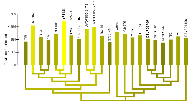
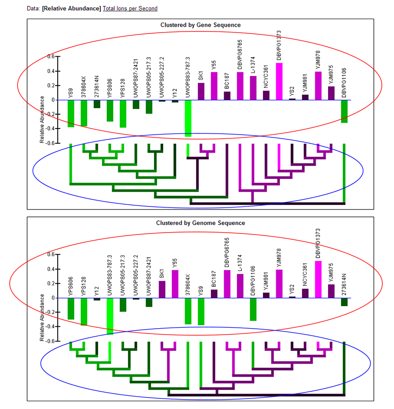
Total Ions per Second (TIPS) data:
- Note: Two graphs are displayed simultaneously on the page. Both graphics are the same, except one has the strains clustered by the current gene's sequence and one has the strains clustered by genome sequence.
- TIPS bar graph: The bar graph portion of the graphic (red ellipse) reflects protein abundance for all strains as quantified by total ions per second. The taller bars (brighter yellow) reflect a higher abundance. The name of each of the strains is written above the bars. The order of the strains in the bar graph is determined by a hierarchical clustering of the strains by either gene or genome sequence and the clustering is visualized by the dendrogram below the bar graph.
- Color-coded dendrogram: The dendrogram (blue ellipse) reflects the clustering of the strains by either gene or genome sequence. The color of any section of the dendrogram reflects an averaging of all the protein levels measured for the strains contained by that section of the dendrogram. This is meant to provide visualization of the quantification data through the dendrogram and assist in finding patterns in abundance that may exist in the context of the clustering.
SNP Viewer
RNA Data
Protein Data
[Peptide Heatmap Data]

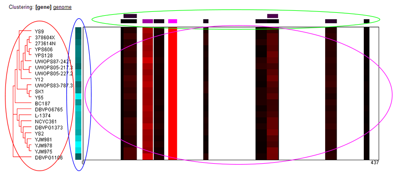
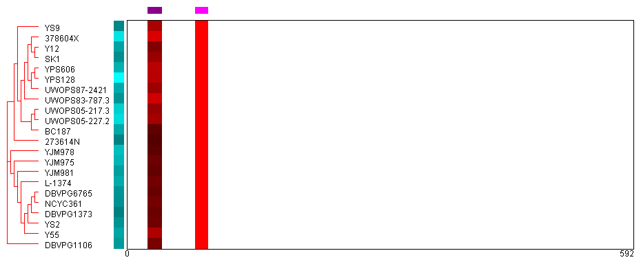
Peptide Heat Map:
The peptide heat map shows the quantitative proteomics data at the peptide level for all strains. At a high level: the sequence of the protein is laid out horizontally, and coverage of the protein
by peptides identified in the study is shown for each of the strains. Only peptides that unambiguously mapped to a single location of a single protein in all strains were considered for purposes
of quantification--so the coverage is the same for all strains. However, the intensity of red indicates the relative abundance of each peptide found, normalized separately for each strain. (Red indicates
higher levels, black indicates less.) Variations in the abundance of specific peptides in specific strains may indicate variations in post-translational regulation, splice variants, or other
biologically-significant findings. The figure is described in more detail below.
Switching between "gene" and "genome" clustering:
The clustering of the strains to the left-hand side of the image may be switched between clustering by gene or genome sequence by clicking the appropriate link. The currently-selected option will show
as [Selected].
About the image:
- Strain clustering (red ellipse): Red dendrogram shows the clustering of strains by either gene or genome sequence. The strain names are listed to the right.
- Protein abundance (blue ellipse): This simple heatmap shows the relative abundance of the protein across all the strains with the brighter cyans indicating higher abundance and black indicating lower abundance. The abundance was determined by summing the total ions per second of the peptides found for the protein (see Protein Data help page).
- Peptide abundance (green ellipse): This shows the relative abundance for each of the peptides used for quantification across all strains. The peptides are positioned to indicate where they fall horizontally onto the protein's sequence. Brighter magenta indicates a higher relative abundance and black indicates less. Recall that all peptides used for quantification uniquely map to a single location in a single protein and is found across all strains. The relative abundance was determined comparing the sum of total ions per second for each peptide across all strains.
- Peptide abundance per strain (magenta ellipse): This shows the relative abundance for each of the peptides, normalized separately for each strain. Red indicates higher abundance and black indicates lower abundance. Significant variation in the relative abundance of peptides for one or more strains may indicate biologically meaningful events, such as post-translational modifications or splice variants.